
Most people who ask for an AI tool to convert Excel data into a dashboard aren’t short on data they’re short on time. A stakeholder wants a visual by end of day, and the spreadsheet everyone’s been updating for six months isn’t going to explain itself. Traditional BI tools eventually solve this, but “eventually” usually means learning a modeling language or waiting on an analyst.
Fortunately, a newer category of tool has closed that gap. These AI systems take a raw .xlsx or .csv file, profile the data automatically, and generate a working dashboard charts, KPI cards, and layout without you touching a pivot table. Some live inside Excel itself; others are standalone web apps built specifically for this workflow.
Quick answer: There’s no single best AI tool to convert Excel data into a dashboard the right pick depends on your setup. If your team already uses Microsoft 365, Power BI with Copilot is the fastest path. If you want a one-off dashboard with zero setup, a standalone generator like ChartGen AI or VibeFactory will do it in seconds, often for free.
This guide breaks down what actually exists, how the underlying process works, and which category fits your situation.
What Is an AI Excel-to-Dashboard Tool?
An AI dashboard generator is software that ingests spreadsheet data and automatically produces a visual, interactive report. It selects chart types, calculates summary metrics, and arranges the layout without manual configuration. In other words, it sits within the broader category of business intelligence software, but it differs from traditional BI in one key way: the AI, not the analyst, makes the initial design decisions.
Most tools in this space follow a similar loop: upload, profile, visualize, refine. First, you upload the file. Then, the model inspects column types and distributions. After that, it proposes a set of charts and KPIs, and finally, you adjust the result using plain-English prompts rather than formulas.
How Does It Actually Work?
Under the hood, these tools run a fairly consistent pipeline, even when the marketing language differs:
- Data profiling the system scans column headers, data types, and value ranges to understand what it’s looking at, such as a date column, a categorical field, or a currency metric.
- Chart-type selection based on that profile, the model matches fields to appropriate visualizations. For instance, time series usually becomes a line chart, category totals become a bar chart, and proportions become a pie or donut chart.
- Insight generation many tools also layer a language model on top of the chart data to write short, plain-English observations, like “Sales dipped 12% in March.”
- Layout assembly finally, components get arranged automatically, often using a template-driven grid system that considers visual hierarchy and grouping.
The natural-language layer is what separates this generation of tools from older Excel “Analyze Data” features. Instead of clicking through menus, you can simply type something like “show me revenue by region as a bar chart,” and the system regenerates that view. This relies on natural language interfaces that let people query data conversationally a pattern that has become standard across the self-service analytics space, and one you’ll also recognize from AI assistants like ChatGPT or Claude.
Pro Tip: Clean data in beats clean dashboards out. Column headers with no merged cells, consistent date formats, and no blank rows will noticeably improve auto-generated chart accuracy across nearly every tool in this category.
AI Tools to Convert Excel to a Dashboard: The Three Categories
Not every tool marketed this way works the same way. It helps to think in three buckets.
1. Native Office AI (Power BI Copilot, Excel’s built-in “Analyze Data”)
These tools live where your spreadsheet already lives. Excel’s built-in AI features automate the most time-consuming parts of data analysis, generating charts and PivotTables in minutes instead of hours. However, Copilot in Power BI is an add-on cost on top of a Pro license, and DAX still has a learning curve for anything beyond basic visuals.
2. Standalone AI dashboard generators
Tools like ExcelDashboard AI, ChartGen AI, and VibeFactory are purpose-built web apps: you upload a file and get a hosted dashboard back, usually within seconds. Some generate complete, deployed web applications with interactive charts, filters, and KPI cards rather than static images or code snippets. As a result, these tend to be faster to start with than full BI platforms, though they offer less depth for enterprise-scale, multi-source reporting.
3. Conversational BI agents
Products like Pulse AI and Fluent BI position themselves as an “always-on analyst.” Rather than building a dashboard up front, you connect a data source and ask questions in plain language. This approach suits ad hoc analysis better than polished, shareable reporting similarly to how a general chat assistant like ChatGPT can answer a data question but can’t deploy a live dashboard on its own.
Did You Know? According to one 2026 roundup of Excel dashboard tools, DAX-based platforms like Power BI still carry a real learning curve even with Copilot layered on top. The AI accelerates chart creation, but it doesn’t remove the need to understand your underlying data model.
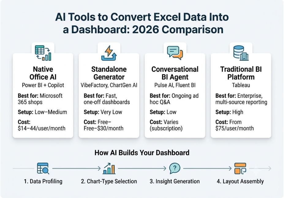
Comparison Table
| Tool type | Example | Best for | Setup effort | Typical cost |
|---|---|---|---|---|
| Native Office AI | Power BI + Copilot | Microsoft 365 shops | Low–Medium | $14–44/user/month |
| Standalone generator | VibeFactory, ChartGen AI | Fast, one-off dashboards | Very low | Free tier to ~$20–30/month |
| Conversational BI agent | Pulse AI, Fluent BI | Ongoing ad hoc Q&A | Low | Varies, often subscription |
| Traditional BI platform | Tableau | Enterprise, multi-source reporting | High | From ~$75/user/month |
Meanwhile, if your data actually lives in Google Sheets rather than Excel, Google’s own Looker Studio offers a comparable free path, though it still requires more manual chart setup than the AI-native tools above.
Step-by-Step: How to Convert Excel Data to a Dashboard With AI
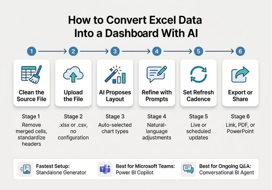
- Clean the source file. Remove merged cells, standardize headers, and confirm each column has a single data type.
- Upload to your chosen tool. Most standalone generators accept .xlsx and .csv directly, with no configuration step required.
- Let the AI propose an initial layout. Review the auto-selected chart types before customizing this is usually faster than starting from a blank canvas.
- Refine with natural language prompts. Ask for specific breakdowns, such as “group by region” or “show month-over-month change,” instead of manually rebuilding charts.
- Set a refresh cadence. If the tool supports it, connect a live file or scheduled upload so the dashboard doesn’t go stale after the first export.
- Export or share. Most tools support a live shareable link, PDF export, or PowerPoint export for stakeholders who just want the summary.
python
# Example: quick automated chart-type suggestion logic
# (illustrates the "data profiling" step conceptually)

import pandas as pd

def suggest_chart_type(series: pd.Series) -> str:
    if pd.api.types.is_datetime64_any_dtype(series):
        return "line_chart"
    if series.nunique() <= 10 and series.dtype == "object":
        return "bar_chart"
    if pd.api.types.is_numeric_dtype(series):
        return "kpi_card"
    return "table"

df = pd.read_excel("sales_data.xlsx")
for col in df.columns:
    print(col, "->", suggest_chart_type(df[col]))
Common Mistakes and How to Avoid Them
- Uploading unstructured data. Multiple header rows or merged title cells confuse the profiling step and produce broken chart mappings. So, flatten your sheet first.
- Trusting auto-generated insights without spot-checking. Language-model-generated commentary can misstate a trend if the underlying column types were misread. Therefore, always verify one or two claims against the raw numbers.
- Skipping a refresh strategy. A dashboard built from a static export becomes misleading within weeks if nobody reconnects it to live data.
- Choosing a category mismatch. A conversational BI agent is great for quick answers but a poor fit if you need a polished, shareable report for a board meeting. In short, match the tool to the deliverable, not just the data source.
Technical Disclaimer: Feature sets and pricing for the tools referenced above change frequently in this fast-moving product category. Details in this article reflect publicly available information as of mid-2026 always confirm current pricing and capabilities on the vendor’s site before purchasing.
FAQ People Also Ask
What is the best AI tool to convert Excel data into a dashboard?
There isn’t a single “best” tool it depends on your ecosystem. Teams already on Microsoft 365 usually get the most value from Power BI with Copilot, while standalone generators like ChartGen AI or VibeFactory are faster for a one-off dashboard with no existing BI setup.
Can ChatGPT create a dashboard from Excel data?
ChatGPT can help plan a dashboard structure, suggest chart types, and even write formulas, but it cannot generate a fully interactive, hosted dashboard on its own it lacks the rendering and deployment layer that purpose-built dashboard generators include.
Is there a free AI tool to turn Excel into a dashboard?
Yes. Several standalone generators, including ChartGen AI and the free tier of ExcelDashboard AI, let you upload a file and generate a basic dashboard at no cost, typically with limits on file size, chart count, or number of uploads.
How is an AI dashboard generator different from Power BI?
An AI dashboard generator automates chart selection and layout from a single upload, aiming for speed with minimal setup. Power BI, on the other hand, is a full BI platform built for data modeling, multi-source integration, and enterprise-scale reporting, with Copilot added as an AI layer rather than as the core workflow.
Can I convert Excel to a dashboard without coding?
Yes. Every tool covered in this guide, from Power BI Copilot to standalone generators, is designed for no-code use you upload a file and interact with it through menus or natural-language prompts instead of writing code.
Conclusion
Choosing an AI tool to convert Excel data into a dashboard really comes down to three questions: how clean is your source data, how much reporting depth do you actually need, and are you already inside the Microsoft ecosystem? Native Copilot tools win for teams already paying for Power BI. Standalone generators win when speed matters more than customization. And conversational BI agents win for repeated, ad hoc questions rather than a single polished report.
Whichever path you pick, remember that the data-prep step matters more than the tool itself a clean, well-structured spreadsheet will outperform a messy one on any platform in this list.
2 Responses